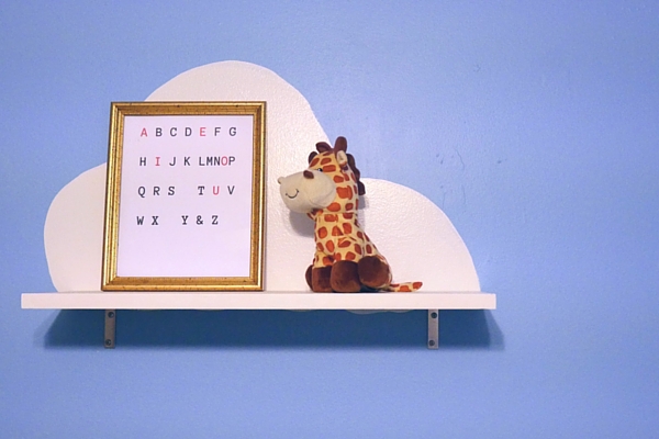
I like this because it helps with the alphabet song. It's not lowercase cursive, but I wanted equal character spacing, for aesthetics.
If you'd like to print this yourself, the PDF attached is a full poster size quality. But you can print it whatever size you'd like.
CLICK HERE for the downloadable PDF. If you just want the image, for whatever reason, feel free to save the one above.

